Gamifying UX Design To Increase User Engagement

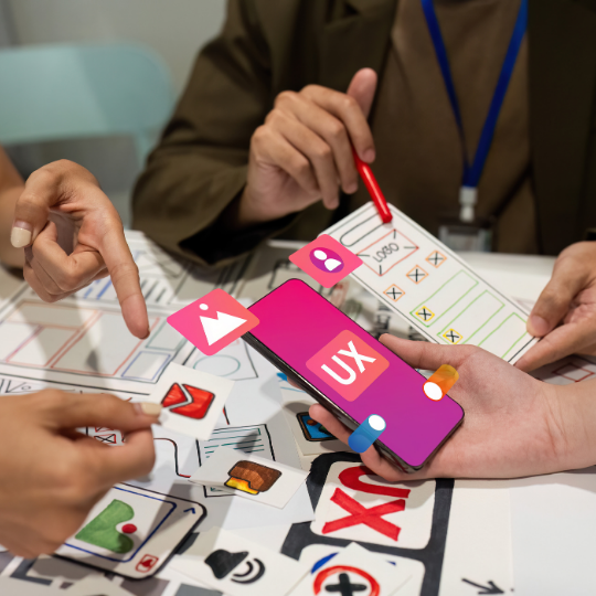
Gamifying UX Design

It is incredibly difficult to lure and maintain the attention of a user in the current digital world. A client is easily distracted out of an experience through the many options available. One of the novel approaches to have gained considerable traction in recent times is gamification in UX design. Through the incorporation of game-like elements in non-game situations, a design can avail more engaging, motivating, and satisfying customer experience. Gamification is a process that can be defined as the employment of the same psychological drives that make games so engaging and successful in promoting user engagement as well.

Gamification In UX Design

Gamification is a design that integrates game mechanics into digital products to increase engagement. It aims at capitalizing on users’ natural drive for achievement, competition, and recognition. Gaming mechanics make the regular interactions exciting and eventful, hence raising the tendency for users to stay more engaged.

An example would be rewarding points for completing tasks or interacting with the product, thus driving certain intended behavior. These points are then typically redeemable for rewards, creating a tangible incentive for further activity. Progression systems, such as leveling or experience points, let the user feel diverted and rewarded, provoking the urge to engage further in order to get even better positions.

Challenges, or what could also be quests, make average tasks more fun by setting clear end goals for the user to reach. Leaderboards add a competitive element. This pushes consumers to try better than others, encouraging them to keep coming back to engage more.

The Psychology Of Gamification

There are several reasons why gamification is so effective. It is the harnessing of fundamental psychological principles associated with human behavior. When used in UX design, such psychological principles become big estates in the user engagement territory.

  • Intrinsic Motivation: Gamification improves intrinsic motivation because the experience with any assignment is playful. If consumers are having fun and being rewarded in an experience, they are naturally motivated to continue and engage more with the product.
  • Achievement and Mastery: There is a feeling in human beings about the innate necessity to achieve and master new skills. Gamification gratifies by having goals and challenges and rewards that accord consumers the accomplishment of something.
  • Social: Here, social motivation for most of the users is via the social necessity and competition. Game-related features like leaderboards and any other type of social sharing features encourage users to interact with others and in turn pile on the social engagement layer of the experience.
  • Feedback and Rewards: Immediate rewards and feedback will help in reinforcing positive behavior, which increases the likelihood that users will repeat the same. Gamified experiences are linearly developed such that instant gratification is offered to get users to keep moving.
Gamifying UX Design

Best Practices To Gamify UX Design

To ensure effectiveness in the field of UX design, gamification has to be duly put into practice. Here are some best practices to consider:

  • Know Your Audience: Customizing your gamification strategy based on the preferences and behavior of the targeted audience. Different users are motivated by different things, so what works for one group, may not resonate with another.
  • Freed of Fun and Function: Gamification should improve, not confuse, the user experience. Ensure that game elements are integrated seamlessly into the design and do not interfere with core functioning of the product. 
  • Keep It Simple: If gamification is overcomplicated, it can confuse users, diminishing the technique’s strength. Start out with a few key game elements and introduce more as the user becomes accustomed to the system.
  • Provide Clear Goals and Feedback: A user should always know what he is supposed to do and what he can achieve. There must be a clear goal with immediate feedback to keep the motivation high for users in any system of engagement.
  • Test and Iterate: Similar to any other element involved with UX design, even gamification requires continuous iterations and testing. Monitor user reactions to different game elements and tune them whenever required for smooth engagement towards its optimization element.

The Future Of Gamification In UX Design

As technology progresses, there is going to be a growing capability for gamification in UX design. Personalization will likely be the trend before the use of AI and machine learning in developing more tailor-made gamification experiences. This means adjusting challenges, rewards, and content based on individual users’ behavior and predispositions.

With equally vast potential, augmented and virtual reality open up new possibilities for vastly more immersive forms of gamification, where the user interacts with the digital tools in a totally unexpected way. 0As social media and digital communities grow in popularity, the move toward more social-type gamification will flourish. Think about more team-based challenges and competitions that can be accessed globally.

Conclusion

With the help of gamification, UX design provides a powerful tool to improve user engagement by making digital experiences interactive, enjoyable, and rewarding. A good designer, using their in-depth knowledge of the psychology behind gamification, will come up with a satisfactory end product, making the user ask for more. With advances in technology, the prospects of gamification in UX design can only grow, opening new opportunities for connection with users in meaningful and motivating ways.

How Vintage Design Trends Are Influencing Modern UI/UX Design?

Modern UI/UX Design

Design is much like fashion—it’s cyclical. What was old can suddenly be new, and this is especially true within modern UI/UX design. The charm of vintage aesthetics is having a strong revival where designers use elements from the past to bring digital interfaces into being that are not just pleasing to the eye but also emotionally engaging. By blending nostalgic design elements into today’s digitally driven functionality, modern designers are able to create highly contextual user experiences that help set their products apart in an increasingly crowded market. Now, let’s proceed to talk about how this vintage and modern ui ux design trend shapes.

Nostalgia As a Design Tool

  • Nostalgia and Emotional Connection: Vintage design elements invoke nostalgia in users by refreshing positive memories and providing comfort with familiarity in views, colors, and styles from the past.
  • Interactive Digital Experience: By making the whole digital experience memorable and more engaging, nostalgia increases bonding with design elements emotionally, where the user gets reminded of past eras when he/she comes across familiar designs.
  • Blurring the Lines Between Past and Present: Nostalgic features such as color palettes, classic fonts, iconic images, and backgrounds from the past assure the relatability, engagibility, and emotional connect of the experience.

The Resurgence Of Retro Typography

One of the most noticeable areas where past design has influenced modern UI/UX is that of typography. Fonts part of eras gone by—like the art deco styles, hand-lettered scripts, and slab-serifs—are creeping back into use in digital interfaces to boost good user experience. Bringing in such a retro typeface brings a unique character to designs, helping brands truly stand out in the visually oversaturated market.

For instance, most websites and applications these days make good use of retro-inspired typography. This is carried out in a bid to give greater prominence to a brand’s identity or evoke an era. This approach will carry visual interest as well as being of substance to storytelling and provide context and depth to user experience. However, designers need to balance vintage fonts with modern readability features to achieve the objective of enhancing and not impeding the user experience.

Vintage Color Schemes Re-conceived

  • Infusion of Vintage Colour Schemes

Retro color trends, from the soft pastels of the 1950s to the loud tones of the 1970s, come to the foreground in contemporary UI/UX design and evoke the nostalgia that sets one apart amidst an influx of digital noise—brand differentiation.

  • Specific Brand Aesthetic Creations

Retro color palettes do everything from mood to alignments with an aesthetic: warm tones, redolent of older photographs, can suggest warmth and nostalgia; bright, contrasting colors with a 1960s flavor can project energy and ebullience.

  • Blending Retro with Modern Design

The fusion of the old colors with new design principles, such as flat design and minimalism, thus gives the feel of nostalgia and renewal, packaging the past into the present.

Personality Through Vintage Visuals

Besides typography and color, there is a place for other retro visual elements in the updated interface, from the grainy texture and faded background to hand-drawn illustrations that add character to digital interfaces.

Alongside this, one trending option is vintage-looking illustrations for a picturesque user experience. Most times, these illustrations come in a handcrafted style and could really make a digital product look closer and cozier, minus the feeling of being way too sanitized. They also contribute immensely to building a unique visual identity, setting a brand apart from the competition.

For example, an app dedicated to vintage fashion could include hand-drawn icons and illustrations that evoke mid-century fashion sketches. This would not only strongly support the vintage theme of the app but also add value to user experience by better visualization and self-explanatory features in the interface.

Modern UI/UX Design

Aesthetic Appeal Must Go With Usability

  • Challenges Using Vintage Design Elements

The incorporation of vintage design elements in modern UI/UX would enhance the aesthetical value, but at the same time, it becomes exceedingly essential that such nostalgic features would not interfere with the functionality or usability of the platform.

  • Typographic and Colour Issues — Potential Problems

Retro typography and colors are full of character, yet they can diminish the legibility of text if overused. The same goes for vintage visual elements that could weigh down an interface and dim the view of the primary functions.

  • Balancing Form and Function

Designers will need to balance nostalgia with usability cautiously to create a better user experience. This means selecting trends from years past that evoke a feel of the brand while executing user needs.

The Future Of Vintage Design In UI/UX

Thus, one can only imagine more and more of these trends presenting themselves in contemporary UI/UX. In other words, it then becomes a challenge to keep such elements fresh and relevant further away from the dangers of overuse or cliché. One should be able to continuously reimagine or progress in bringing the old school aesthetics into both nostalgic and cutting-edge interfaces. 

Indeed, what is the rebirth of vintage and modern ui ux design if not a one-night stand with the seduction that is the past? Through meticulous retelling, reweaving, and remixing of retro elements in modern digital artifacts, the shape of language that an appealing experience can take in UI/UX will be at a designer’s will, providing fundamentally visually compelling and emotionally involving experiences for the user. It’s as if, indeed, the past will always have a place in shaping the future of design.

AI-Driven UX Testing: How Machine Learning Changes User Research? 

User experience has always been an important concern in the development of digital products. However, traditional UX testing has often relied on manual processes, which can be time-consuming and expensive, sometimes limited in scope. That’s where AI-driven UX testing comes into play: a game-changing approach that leverages machine learning to streamline and amplify user research. As AI technology continues to evolve, it is fundamentally changing how designers testing through ai and ux research, whereby they can now gain more accurate insights faster and, more importantly, improve the user experience. 

The Shift From Traditional To AI-driven UX Testing

A/B testing, usability studies, and user interviews are all traditional methods of UX testing. They form the foundation of user research, dating back decades. While effective, these can be very labor-intensive; gathering data and analyzing it may take a lot of time and resources. Another limitation is that traditional testing often captures only a snapshot of user behavior and can miss nuanced insights that could lead to more impactful design decisions.

In turn, AI-driven UX testing uses machine learning algorithms to push these processes onto automation and enhancement. While manual research might find it difficult to scan through an immense amount of data with precision, AI-driven tools guarantee speed and precision. This allows designers to make data-driven decisions more confidently than ever before.

ai and ux research

How AI And Machine Learning Enhance UX Testing?

  • Automated Data Analysis: Key among the benefits of AI-driven UX testing is the fact that data analysis is automated. Machine learning algorithms can process massive volumes of real-time user data, making the detection of patterns and trends much quicker than manual methods. For example, AI can analyze user behavior on a website or app, identify areas where users are struggling, or dropping out. This also allows designers to quickly pinpoint usability issues that can be improved upon for a better user experience.
  • Predictive User Behavior Modeling: The predictive analytics capability of machine learning lets it forecast user behavior based on past interactions. This allows AI-driven tools to predict the way users are most likely to interact with new features or design changes by analyzing historic data. Such predictive modeling guides the designer through informed decisions on which elements to test and optimize and reduces risk from poor user reception to enhance the chances of success.
  • Personalization at Scale: Perhaps the burgeoning need and frontier of UX design where AI-driven testing is leading a charge to make it happen. Machine learning algorithms analyze individual user preferences and behaviors to deliver personalized experiences that cater to specific needs. For example, AI can segment users based on their usage patterns and test variations of designs against each group to see what works best. It is the level of personalization that cannot be manually attained and done to scale. This leads to more engaging and effective user experiences.
  • Real-time Feedback and Iteration: In traditional UX testing, the feedback loop is very long. In most cases, it takes a lot of time to receive user feedback from which designers can make adjustments. AI-driven UX testing shortens this cycle significantly. With the possibility of real-time data analysis and automated feedback mechanisms, designers can iterate quickly in short time-feathers, making changes on-the-go and testing them almost immediately. This agile approach ensures continuous improvement and quicker times to market for digital products.

Challenges And Considerations

Though AI and technologically driven UX testing offer considerable benefits, they also surge along with certain challenges. First off, too much reliance on AI may take the human aspect out of UX design. Powerful machine learning algorithms come without certain emotional and psychological elements that make up human experience and can be intuitively anticipated by human researchers. A balanced approach is required to interwork AI-enriched insights with human-centered design principles.

Other considerations, of course, are data privacy. As AI tools collect and process huge volumes of user data, managing that data in an ethical and secure way is of utmost importance. Designers and researchers have to be super transparent about their data collection, and follow all the regulations, like GDPR, to keep users’ trust.

The Future Of AI-Driven UX Testing

But as AI and machine learning for UX testing are still in their infancy, the scope for growth is immense. With the growth of AI technology, more advanced tools will emerge that will provide deeper insights on user behavior and preferences. Furthermore, one could probably even expect from advanced future proposals AI-driven tools whose main task and purpose are the ability to simulate user behavior inside virtual environments.

That is, moreover, democratization in access to such technologies that will be enabled as AI is increasingly commoditized; meaning becoming more affordable and more accessible, smaller companies and start-ups can harness such technologies. Making the tools mainstream within the UX market is going to boost the competitive nature of the market, in which user experience is deemed one of the biggest differentiators in any digital product.

Conclusion

AI-powered UX testing changes the way one can approach user research, as it acquires quicker, more precise, and personalized insights into the way users behave. What automates data analysis, predicts user behavior, and enables scalability of personalization—all capable of real-time feedback—are the designers of change in the companies striving for more effective and engaging digital products. And the future of AI and UX research really does look bright when you consider it: the possibilities to change and innovate are really there for the taking.

Best Practices For Designing Augmented Reality (AR) and Virtual Reality (VR) UI

ar vr design practice

Augmented reality and virtual reality technologies are revolutionizing the way people engage with digital information, making experiences that previously were unimaginable a reality today. If a user interface design were to be made for these technologies, this would present problems and opportunities quite different from conventional design principles in 2D. Finally, appropriate AR VR design practice will consider user immersion, interaction, and comfort. In the following article, we’ll share the best practices for designing UIs in AR and VR for a seamless and intuitive user experience.

What Is AR And VR?

AR, most commonly referred to as augmented reality, is a display technology that lays digital content over the real world. This increases perception and interaction of a user with their ambient. Common applications include mobile AR apps and AR glasses.

Virtual reality (VR) fully immerses a user in a digital environment, replacing their real surroundings with virtual ones. Applications for VR run from gaming to training simulations.

Core Principles Of AR And VR UI Design

  • User-Centered Design

User-centered design is the bedrock of effective AR and VR UI design. Much information on the user, their behavior, and the environment in which they operate must, therefore, be considered. This all comes down to research and usability testing in a bid to gain insights that will help fine-tune the design based on real user feedback.

  • Simplicity And Clarity

This is in light of the fact that AR and VR are rather immersive, and simplicity, clarity of UI design become very essential. Too much information or too complex an interface can lead to confusion and makes for a bad experience. Designers have to do their best with the delivery of fundamental information in as clear and simple ways as possible, ensuring not to puzzle the users through irrelevant visual detail.

  • Natural Interactions

Design for natural interactions; increase the user experience by creating an intuitive and easy-to-use interface. Gestures, voice commands, and other methods of interaction should imitate behaviors occurring in the real world to reduce the learning curve. This approach will not only make the experience more immersive but also increase user satisfaction.

Best Practices In AR UI Design

  • Contextual Relevance

In AR, digital factors are overlaid on top of the actual world; therefore, one should be certain at all times that they are relevant in context and complement their surroundings. Digital content irrelevant to, or misplaced in, a user’s environment can reduce immersion, reducing the effectiveness of the AR experience.

  • Minimize Screen Clutter

The AR interface should be designed not to overwhelm the users. So, it has to focus on minimalism through filtering, highlighting essential elements, and provide layers of information that bring depth but not clutter to their view. This will help in bringing a perfect balance between digital content and the real world.

  • Anchoring And Alignment

Anchoring and aligning digital elements in AR are very critical for the continuity of experience. Otherwise, misaligned content can result in a disjointed user experience. Under- or over-response by users to the AR interface occurs when elements are not aligned correctly. Precise placement of digital elements enhances overall usability.

  • Consistent And Intuitive Interactions

The patterns of interaction should be consistent to genuinely have an effective AR experience. A user needs to be able to use known gestures and controls across many applications. This keeps the learning curve low and makes the interface more intuitive.

  • Responsive Feedback:

Feedback directly to a user’s actions is paramount in AR. Both visual and aural feedback tells users what the consequence of their action is and lets them feel more engaged, making sure they have control over the experience.

Best Practices for VR UI Design

  • Immersive Environments

VR is all about creating fully immersive environments that transport users to another dimension. While designing, one should focus on creating a coherent and engaging virtual world, drawing the attention of the user by providing a seamless experience. 

  • Spatial Awareness And Navigation

Spatial awareness can be easily lost in VR, since users are moving around in 3D space. The designer should provide visual cues and navigational aids to allow the user orientation within the virtual environment, including easy-to-use navigation methods and clear indications of direction and movement.

  • Comfort And Ergonomics

User comfort is the most important consideration in any VR design. In other words, the interface shall be designed to minimize the possibility of physical strain or even motion sickness. This includes the ergonomics of user interactions, the placement of elements that a user can interact with, and designing navigation controls.

  • Layering Of UI Elements

The UI elements of VR must be gainfully layered to express depth and space. Controls and other primary controls displaying important information can be at arm’s length, while secondary elements can be farther away. This helps in maintaining focus and reduces visual clutter.

  • Intuitive Controls

Familiar and intuitive controls in VR minimize the learning curve, making the experience very user-friendly. It should be easy to understand and use interaction methods whether hand gestures, controllers, or eye-tracking to ensure a seamless and enjoyable experience.

  • Responsive And Dynamic Feedback

This, therefore, is important in guiding the user on what next actions to take.Real-time feedback in VR is crucial in creating a feeling of immersion. A blend of visual, auditory, and haptic feedback should serve to confirm user actions and enhance the feeling of presence within the virtual environment.

Conclusion

Designing principles traditionally followed in the case of user interfaces for AR and VR need a turn away from the traditionally followed designing principles, with a focus on immersion, usability, and comfort. Keeping these best practices in mind will let designers come up with engaging and accessible experiences that unlock the fullest potential of AR VR design practice. Keeping oneself abreast of trends and constantly fine-tuning designs shall remain the hallmark for delivering great user experiences in this exciting field.

How Will Ultra-Fast 5G Connectivity Influence UI/UX?

The rollout of ultra-fast 5G connectivity is bound to transform all other dimensions of digital life, with one of the most significant areas of change being that of User Interface (UI) and User Experience (UX) design. Besides providing fast data connection and less lag time, 5G boosts reliability in the networks, which is thus going to redefine digital platforms’ interaction and the new design possibilities through creating more engaging, responsive, and immersive experiences for the users. This article will explore how connectivity 5G and UI/UX will shape design, specifically looking at what to expect from designers in this new age of connectivity.

5G and UI/UX

1. Speed And Responsiveness

First in line, and most immediate, is the incredible speed that 5G brings to the game, a quantum leap from 4G, which some experts estimate at 10 to hundreds of times greater. All this is a lot shorter in loading web pages, applications, and every digital platform in common use. In simple terms, a UI/UX designer could create interfaces very deep, complex, and full of data without slowing them down.

With 5G, users will demand near-instantaneous reactions to their actions. When scrolling through a website, seeking to view high-definition images, or watching video, more compelling experiences will be desired that are free of buffering. 

2. Richer Multimedia Experiences

This large bandwidth in 5G is going to bring in the mass use of higher-grade multimedia content, possibly even 4K or 8K for videos, high-fidelity audio, and detailed animations. This way, UI/UX designers will be more liberated to infuse high-quality images or other multimedia components into their designs without limitations in performance.

For instance, video backgrounds, interactive animations, and high-definition product showcases all become easily doable for many more users as 5G begins to make it easier to deliver those experiences in an effective manner. This means that companies can more effortlessly come up with more visually incredible, jaw-dropping, and immersive interfaces that are bound to catch the user’s attention and keep them continuously engaged.

3. Seamless Integration Of AR And VR

Perhaps most thrillingly, one consequence of 5G on UI/UX design will be the full integration of easy AR and VR experience with everyday life. 5G’s low latency and high rate will make real-time, interactive, highly responsive AR and VR experiences smooth in their delivery.

For AR, this might entail further deployment of interactive overlays on mobile devices, allowing users to interact with virtual objects seemingly anywhere in a real-world environment. In VR, it could mean more immersive virtual environments that users can explore without much lag or disruption.

Designers will have to think about how these can be integrated into existing interfaces and how to create new interfaces that take full advantage of the capabilities of AR and VR.

4. Enhanced IoT And Smart Device Interaction

Internet of Things growth will burst through when 5G comes alive because higher speeds and reliable connections will mean greater numbers of devices that communicate with each other all the time. This is going to have a real impact on the design of UI/UX within smart homes, connected cars, and wearable devices.

In 5G, customers expect an experience to be fully interactive across their multiplicity of devices, controlling smart home systems, monitoring health data from wearables, and connected vehicles. As designers, we need to design interfaces through which it becomes easy and intuitive to control devices across multi-device setups, but it is also important to keep this consistency and coherence clear across all these devices.

In addition, this potential information processing from a myriad of sources in real-time can help create novel and context-aware personalized experiences for them. 

5. Create More Personalized Experiences

It has been found that, while handling a lot of live, exploding data in real-time, the power of 5G will thus provide more personalized, context-aware experiences for UI/UX designers. With the information, the design of an interface will always be changing, suiting the current context, preference, and behavior of a user.

For example, apps and websites may actively display personalized contextual content based on the user’s current location, prior interactions, and the activity they are presently engaged in. This will really interest users because experiences and tools are so customized, which is bound to raise satisfaction and loyalty. 

With the mainstreaming of 5G, context-aware design will be more mainstream, and communication among the devices and with the cloud service will be smoother. 

6. Enhanced Collaboration And Real-Time Interaction

With speed and reliability, 5G will deliver rigorous real-time collaborations both in professional and academic environments. This would mean the need for UI/UX designers to shape interfaces that give the power of smooth real-time interaction through video conferencing, shared workplaces, or collaboration tools.

Real-time editing and designing in the preparation process of a project, where various people can work on a single document or design simultaneously without a difference in time, are some of the ways 5G is likely to support projects. Real-time responses in virtual classrooms offer learning experiences between the student and teacher in a bid to support educational projects.

Conclusion

Ultrafast 5G connectivity will fundamentally change the design of UI/UX, becoming rich in multimedia, seamlessly AR- and VR-integrated, and interacting face-to-face with contexts. UI/UX designers would get unprecedented opportunities with the coming of high-speed 5G, being able to design richer, more engaging, more responsive, and immersive UIs.

The new era, however, will place demands on designers to rethink the traditional way of doing things in light of new technologies and principles of design that could make the best use of 5G and UI/UX. A designer who looks into the future will be up-to-date with respect to his work in a 5G dynamic world so that the expectations of users are changing continuously.

The Convergence Of UI/UX Design And Brand Identity For Cohesive Experiences

In today’s digital world, where every brand is fighting for eyeballs, it becomes important to provide some memorable experiential cohesion, and here lies the secret behind such seamless experiences—it truly lies at the confluence of convergence of UI/UX design and brand identity.

These elements combine to deliver a coherent and apparent experience at every point of contact that the user has with your brand, and through this experience, one will feel and voice the fundamental brand values. The article aims to explain how the convergence of UI/UX design and brand identity works as a team in creating experiences that have a single unified, powerful impact. 

UI/UX Design And Brand Identity

It starts by creating an understanding of what each comprises and then explains how they converge into powerful brand experiences.

  • UI Design: This stands for the visual part of the product or website: layout, type, color, buttons, and other interactive elements. It involves designing what is actually placed on the screen and with which the user interacts.
  • UX Design: UX design means the overall experience of a user on a product or service. It involves usability, accessibility, and the emotional response a user develops while using the product. The point of UX design is to make interactions intuitive, efficient, and full of enjoyment.
  • Brand Identity: Brand identity involves creating and styling the brand’s visible elements—logos, colors, typography, and design style—into compelling expressions that denote or suggest what a brand wants to show about itself in people’s thinking.
Convergence of UI/UX Design

The Need For Cohesive Experiences 

  • Consistency Builds Trust: Users trust a brand when they get used to design elements and essential interactions with the brand. Such consistency remarks to the user that they are on the right page.
  • Brand Recognition: A strong and coherent brand identity builds brand recognition. If your UI/UX design conveys the identity of your brand, then such consistency can easily be recognized by users on any different platform and device.
  • Emotional Connection: A well-aligned brand identity and UI/UX can evoke emotions that call out to users. Such emotional connection could change casual users into loyal customers or advocates for your brand.
  • Differentiation: In a crowd, a sole and alike brand experience can differentiate your brand from the rest of the competition. This helps in creating a different identity that always stays distinct in the minds of the users.

Brand Identity Integration Into UI/UX Design

This is necessary to bring out brand identity in all aspects of UI/UX design work, providing an integrated, seamless experience. How to go about it:

Visual Consistency

  • Colors: They are an important part of brand identity, with the need to use them consistently in the different UI elements. Choose a palette that communicates your brand’s personality and stick to it across the website, the app, or any other digital platform.
  • Typography: Like colour, needs to be representative of your brand’s voice. Formal, playful, or modern—typefaces need to gravitate towards these characteristics of the brand. Plus, the consistency in typography across all interface elements will contribute to brand identity.
  • Imagery and Icons: The style of the imagery, illustration, and icons needs to be typified under the brand’s visual language. It could be minimal or give much detail to the structure—the illustrative elements must communicate the brand’s essence.

Tone Of Voice

This tone of voice, in your content and microcopy alike—think button labels, error messages—shall be that of your brand’s personality. Be it friendly, authoritative, or light-hearted, the tone should come across at every user interaction. Alignment means users hear the same “voice” throughout their journey, reinforcing brand identity.

User Journey And Experience

  • Storytelling: A seamless user journey explains the story associated with your brand’s values and mission. Every user experience, from onboarding to checkout, has to have its little tale: a subset of the grander brand story.
  • Emotional Design: Think about what emotions one would want to have with a brand, for which the user experience is designed. For instance, the brand identity is luxury-oriented, so the UX needs to be exuberant with elegance and sophistication.

Interactive Elements

  • Buttons and CTAs: Button and call-to-action design and placement should match the brand identity. The text of the CTAs should also be on the brand to that brand’s tone, which enables users to interact with them naturally and very much in a strongly branded way.
  • Animations and micro-interactions: In terms of subtle animations and micro-interactions, this can improve the user experience, thereby enhancing brand identity. For example, the use of bouncing animations in a more playful brand or sleek, minimal transitions in a tech-focused brand.

Challenges And considerations

However, in the integrating process of UI/UX design with brand identity, no matter what, one always faces brand identity to keep the balance of creativity and functionality. Designers should make sure that their search for developing a unique brand experience won’t put the usefulness at stake. In any case, the user experience should always be intuitive and straightforward but branded with specific elements for the brand.

Also, consideration has to be given to the UI/UX of brands. In other words, a united experience has to be inclusive so that all users, including those with disabilities, find the ability to effectively deal with the brand. This, therefore, includes color contrast, size of fonts, navigation through keyboards, and all other elements, so that the availability of brand identity is there for everyone.

Conclusion

It is the amalgamation of UI/UX design and the identity of the brand toward the most consistent and powerful user experiences. Corresponding to all these elements, both visual and interaction-based, copy-based, and consistent with the brand’s identity, designers will be able to encourage trust-building, drive brand recognition, and create emotional attachments among users.

With this evolution in digital experiences, this very Convergence of UI/UX Design and brand identity is going to form the base of how iconic brand strategies will continue to allow businesses to shine amid a more competitive marketplace.

Breaking Down The Barriers- Accessible UI/UX Design For All Users

As the world is going digital—with websites and applications being part of everyday life—the design for accessibility is no longer a best practice but a requirement. Accessible UI/UX design means that all users, regardless of ability, can make use of your product without any kind of barrier. This includes people who have visual, auditory, cognitive, or motor impairments, and it also includes the users of assistive technologies such as screen readers. By putting accessibility at the forefront, you are not only being more inclusive but also expanding your outreach.

Accessibility In UI/UX Design

In UI/UX design, accessibility refers to providing both user interface and user experience available to as many users as possible, regardless of their different abilities or any other form of disability. This requires the consideration of a huge number of aspects, spanning from the visual and auditory design to the very simplicity of navigation and even interaction. The objective is to eliminate barriers that may impede or limit users’ access to content or the performance of certain actions.

Accessible UI/UX Design

Importance Of Accessible Design 

There are several reasons why accessible design is important:

  • Legal Compliance: Accessible products are legally and socially challenged by legislation related to accessibility. For instance, in the United States, there is the Americans with Disabilities Act, while in Australia, a DDA exists.
  • Inclusive User Experience: You design for all people, irrespective of their abilities, all within one product. This builds inclusion and shows social responsibility.
  • Increased Usability: Very often, the accessible design also improves general usability. For example, captions on videos may help not only those with hearing challenges but also others who are in noisy environments.
  • Broader Reach: Making one’s product accessible opens it to millions of people with disabilities across the world.

Core Principles In Accessible UI/UX Design

Several core principles should be taken into consideration in the effort to create accessible designs. These include, among others:

Perceivability

  • Text Alternatives: Provide text alternatives for nontextual content, such as images, videos, and icons. This allows the screen readers to convey the information to users who have visual impairments.
  • Color Contrast: Text and background color should have enough contrast to easily read the text for low vision or color-blind visitors. You can check for this with the WCAG Contrast Checker.
  • Scalable: Users are able to scale text up to 200% without losing any content or value. It’s a very essential underlying fact that needs to be considered for users with impairments.

Operability

  • Keyboard Navigation: Users with motor disabilities often rely on keyboards or other assistive technologies and not a mouse to navigate an interface. Design your interface fully using a keyboard.
  • Accessible Forms: Ensure that forms are easy to navigate and that labels are clearly associated with their corresponding input fields. Use of placeholder text should be supplementary, not as a stand-in for labels.
  • Time Limits: Do not impose time limits on interactions, or at the very least, allow time limits to be extended or turned off, as sometimes more time is needed by users experiencing either cognitive or motor problems.

Understandability

  • Plain Language: Write in clear, concise language, using as simple grammatical structures as possible and avoiding verbose sentences. It should be easily readable and understandable by all levels of cognitive grouping.
  • Consistent Navigation: Keep your navigation consistent. It means that it should be easy for users to predict where they could land should they click on some link or button.
  • Identification and Recovery from Errors: Clearly identify errors in forms or interactions and suggest how the error can be corrected. For example, when a user inputs the wrong email format, show a message that explains how to fix it clearly.

Robustness

  • Assistive Technology Compatibility: Make your content compatible with most of the available assistive technologies through the use of semantic HTML, ARIA landmarks, and other best practices.
  • Responsive Design: Design your interface to be responsive across different devices and screen sizes. This helps all users who need to zoom in or have large text set on their devices.

How To Make An Accessible Design?

The development of an accessible UI/UX design is a practice that needs to be incorporated from the design and development phase. Here is the way to execute the same:

  • Add Accessibility in the Design Process

Accessibility shouldn’t be something you think of afterward. Make it part of the design process from square one. That means accessibility considerations are within your brief, your wireframes, and your prototypes.

  • Do User Testing on Diverse Participants

It is part and parcel of the design process, including users with various disabilities to ensure that all problems related to accessibility are detected that a designer may not think about. Automated and manual accessibility testing may be useful.

  • Accessibility Tools

You have many tools that can assist in checking, and increasing the accessibility of your designs. Some of these tools include WAVE, Axe, and Lighthouse, which all have the ability to scan your website or application automatically.

  • Stay up-to-date with Accessibility Standards

Keep you current on the latest standards in accessibility, such as the Web Content Accessibility Guidelines, defining ways in which digital content can be made more accessible. 

  • Educate Your Team

Everyone involved in the design and development process should know how important accessibility is. This can be achieved via periodic trainings and awareness sessions to keep the focus on accessibility.

Conclusion

Breaking the barriers for accessible UI/UX design is not a question of compliance; it’s how one allows people, regardless of ability, to use your digital products. Application of accessible design principles and best practices in everyday work gives you a chance to bring in an inclusive experience for the benefit of all users. By doing so, you will contribute to a more fair digital world and set your brand apart as an accessibility leader.

The Role Of Emotional Design In Creating Memorable User Experience

Making a memorable user experience is more important than ever in this digital age, where so many products and services are racing for the attention of users. While functionality and usability are no doubt very important aspects of UI/UX design, they alone will not build strong emotional connections with users. UX emotional design deals with the design of interfaces in such a way as to engage the user’s positive emotions.

A good relationship with a product will increase its differentiation and memorability. Where products elicit an emotional response from users, designers can then create experiences that connect at deeper levels, leading to loyalty, satisfaction, and long-term engagement

ux emotional design

How One Understands Emotional Design? 

1. Three Levels Of Emotional Design

According to Don Norman—one of the most famous designers and considered to be the founding father of design—there exist three levels for emotional design: visceral, behavioral, and reflective. This forms the different ways through which users experience and interact with a product.

  • Visceral Design: This level caters to users’ very first—instinctive—response to an appearance. This shall set out an aesthetic, color, typography, and layout that will evoke feelings of excitement, curiosity, or pleasure.
  • Behavioral Design: This level has to do with the usability and functionality of the product. It is concerned with how easy and pleasing a product could be to use. If a product were intuitive and able to perform well, then it would evoke positive feelings pertaining to ease and efficiency.
  • Reflective Design: This is a level the user reflects on after having an interaction with a product. It holds the meaning in personal and cultural dimensions that the users associated with the product, and this can give rise to emotions such as pride, nostalgia, or even fulfillment.

2. The Impact Of Emotions On User Behaviour

Emotions significantly form user behavior and decision-making. Positive affect engages people, motivates them to learn more, and increases the likelihood of revisiting a product. The negative ones, such as frustration or confusion, result in abandonment and dissatisfaction. Emotional design concerns eliciting these emotional responses through creating a user experience that can do more than work—also delight and reward. By knowing their target audience’s emotional triggers, designers can tailor-make experiences that foster positive emotional responses to the product and increase the bonding between a user and a product.

Methods Of Applying Emotional Design

1. Human-Centered Design

Emotional design is harnessed by fundamentally understanding the needs, desires, and triggers of a user’s emotions. Human-centered design puts the user at the forefront of the design process. It is a process that entails studying users to understand their personal creative, and emotional experiences while using a product. The study of users helps designers make out what drives and fulfills them, thus giving them an opportunity to think of user interfaces that respond to these emotional needs. 

2. Design Storytelling

Storytelling is among the most popular strategies to evoke an emotional design since it really makes a user associate himself with a product. It is through narratives that values are delivered into a product, its branding, and corresponding emotions get embedded. A good story turns everyday mundane tasks into engaging experiences, giving the user a better feeling of being a part of it, hence more involvement and investment in the outcome. 

3. Visual And Interaction Design

The strongest elements within the emotional design area would have to be the visual ones: color, type, and imagery. Colors can even be trigger-specific; the blue tries to calm one down, while the red usually gives a sense of urgency. Again, the typeface has a bearing on how the user may view a brand: bold fonts that speak of strength and elegance, playful fonts speaking of fun and creativeness. This is then followed by interaction design, which brings animations and micro-interactions along with it. 

4. Surprising Delight

Among the central components of emotional design is the ability to surprise and delight users. A designer can build positive emotional experiences that are going to be remembered long after the interaction if unexpected moments of delight are infused into a product. These can be small moments—think an engaging animation when some process has been completed—or bigger, such as reward systems that let people earn badges or discounts just for being loyal. 

5. Designing For Empathy

Empathy has a key role in emotional design; it means understanding and sharing users’ feelings. This can be realized by walking in their shoes, observing, and noticing what emotional states happen. This will help the designer to create interfaces that are capable of adapting to the context of the user at any given moment—either stressful or relaxed. 

Conclusion

Emotions are the key to user interfaces that not only answer the functional needs of users but also trigger some kind of positive emotional response. Crucial for this are human-centered design, storytelling, and visual design, complemented by techniques of empathy.

The emotional design has a number of advantages that include raising user engagement and brand loyalty to differentiation in the competitive market and better satisfaction of users. It will be an UX emotional design that differentiates and makes products memorable in a world where so much is at their fingertips digitally.

Designing Intelligent Interfaces With AI In UI/UX

Artificial intelligence (AI) in UI/UX design is one of the most important aspects brought about by technological advancement. AI no longer acts as a simple tool for task automation but serves as a core constituent in the process of constructing intelligent interfaces for improving user experiences. It helps designers, via AI, to craft an interface that—besides being a detailed, intuitive, and adaptive one—copes with the multiple needs of different users. It’s the shift changing everything in how we approach design: creating not only beautiful but context-aware and responsive interfaces. How integration of ai in ui ux is changing designs and some strategies for creating intelligent interfaces are explained below.

The Role Of AI In UI/UX Design

  • Personalization at Scale

One major way AI is really transforming the domain of UI/UX design is through personalization. Artificial Intelligence can go through terabytes of user data to understand user preferences, behaviors, and needs. In doing so, this data-driven approach contextualizes interfaces for users, making them more engaging and relevant.  

  • Better User Interactions

Only AI-powered interfaces will truly understand and predict user intent, making interactions more natural and efficient. Combining technologies such as natural language processing and machine learning, AI will interpret user inputs—text, voice, and gestures—and make a response in a way that is conversational and human-like. 

  • Adaptive And Predictive Design

AI makes possible adaptive interfaces that change in real-time depending on the behavior of the users or the environment. For instance, an intelligent interface could change its layout or functionality based on the device, time of day, or current user location. Another heavyweight application of AI is predictive design, which steps a little further ahead in anticipating user needs and actions. 

integration of ai in ui ux

Key Strategies For Integrating AI In UI/UX Design 

  • Prioritize User-Centric AI 

While AI will significantly enhance interfaces, it’s important to notice how the technology may also be overwhelming when it doesn’t serve the needs of the user. Begin by pinpointing the bottlenecks in the journey that AI can resolve. The integration of ai in ui ux should be at most frictionless and non-intrusive—just improving the experience without giving them the feeling of talking to a machine. 

  • AI For Data-Driven Decision Making

AI is especially good at crunching large amounts of data and spotting trends that could not have been patently obvious to a human or a designer. Use this capability to your advantage when it comes to the process of design decision-making. For example, let AI help you analyze user feedback and interaction data and build usage trends of what is working versus what isn’t. 

  • Integrate AI Ethically And Transparently

With the surge in the role of AI in UI/UX design, comes an added level of responsibility related to ethical issues. It should be brought to the notice of users always that AI is in use and their data is being used for some purpose. Transparency will help in building trust and making users comfortable in engaging an AI-powered interface.

Challenges In AI-Driven UI/UX Design

  • Balancing Automation With Human Touch

It is all about balancing automation with a human touch: the most serious challenge of AI-driven design. While AI can automate most of the user interface, the touch of a human hand needs to be retained, for it keeps them connected to the user. Getting the balance right keeps the interface effective without sacrificing some of the empathy and understanding that users will appreciate. 

  • Dealing With Complexity And Consistency

AI-driven interfaces can be complex, especially if they are adaptive or predictive. To this end, consistency in design and user experience across various AI-driven elements is sometimes very hard to achieve. Designers must be able to program and test these kinds of interfaces carefully for them to function together harmoniously and provide cohesive experience.

  • Staying Current With AI Advancements

Artificial intelligence is a fast-growing field. For a designer to accomplish the potential that is created by these technologies, he/she has to be current with these changes. These many changes are hard to keep up with, especially in smaller teams or organizations.  The focus should be mainly on the essential principles of good design.  

The Future Of AI In UI/UX Design

  • AI As Co-Designer

In the future, AI can also assume a more collaborative role in the actual design process. It will no longer be a tool that designers use but will take on a more co-designer role: making suggestions, generating options for design, and even automating some parts of the design process. Such kind of collaboration could give rise to even more innovative and effective designs.

  • Hyper-Personalization

With the advancement of AI technology, the construction of extremely personalized experiences will grow in sophistication. AI will understand and forecast user needs much better and create individually unique interfaces. It will then spawn a development of interfaces that adjust in real-time because of changes in the user’s behavior and preferences, and context of use, offering a frictionless and rather very personalized experience. 

  • Ethical AI Design

The more AI gets embedded in everyday user interfaces, the greater the importance of ethical design will become. Designers will have to ensure AI is responsibly used in terms of privacy, transparency, and fairness for the user. In this respect, challenges associated with AI-driven interfaces will have to be solved by setting proper guidelines and best practices for ethical AI design. 

Conclusion

AI is turning a new page in the field of UI/UX design, offering possibilities for intelligent, adaptive, and individualized interfaces. Using AI’s ability to deliver very rich user experiences, designers will, in the near future, be able to offer what could only be imagined earlier. However, the challenges remain: how to find a balance between automation and human feel, how to manage complexity correctly, and the assurance of ethical usage.

The role of AI in the field of UI/UX design has evolved with changing technology. The more technically progressive it is, the endless are the possibilities for further innovation. Only integration of ai in ui ux and being true to its design principles—user-centered—can designers create intelligent interfaces that meet and even exceed user expectations.

No-Code Tools And Their Impact On UI/UX Design

The uprising of no-code in UI/UX design affected many different industries, making it possible for people to develop complex applications, websites, and digital products even if they do not have any or have limited programming skills. These tools have really made a difference in the UI/UX design space by democratizing design and development processes and helping to empower designers, entrepreneurs, and nontechnical teams to bring their ideas into action with less reliance on traditional coding skills. It also brings challenges that must be solved to create effective and user-friendly interfaces.

The Rise of No-Code Tools

  • Accessibility And Democratization

No-code tools have dramatically reduced entry barriers in digital design and development. Conventionally, any digital product requires an in-depth understanding of programming languages, frameworks, and software development processes. Currently, through intuitive drag-and-drop interfaces and pre-built components, no-code platforms are in a better position to empower more diverse people in the process of UI/UX design.

  • Increased Velocity And Efficiency Of Design

The most compelling benefit of no-code tools has to be the speed at which designs can be created, iterated, and deployed. Traditional development involves iterative cycles of design, coding, testing, and debugging. No-code platforms speed this up through streamlined processes, faster prototyping, and testing of UI/UX designs. It’s not only going to reduce time-to-market, but is also going to allow designers to test several ideas really quickly. 

  • Empowerment Of Nontechnical Creators

No-code tools empower non-technical individuals in teams—marketers, content creators, and product managers—to contribute directly to the design and development of digital products. This also decreases dependencies on developers for everyday tasks, letting technical teams be oriented towards more complex and strategic initiatives.

no-code in UI UX design

Impact On UI/UX Design Processes

  • Simplified Prototyping And User Testing

Prototyping is an important stage of UI/UX design. It means the translation of concepts into interactive models testable with users. No-code tools simplify this process by having built-in features and templates, which can be modified by the designer without coding. This allows rapid adjustment according to user feedback in a more effective and usable design. 

  • Greater Collaboration And Iteration

Most no-code platforms will have inherent collaboration features that let one enable communication between team members. This helps designers, developers, and stakeholders work on the same thing in real-time. Stakeholder feedback, suggested changes, and versions could be tracked with ease. Within a collaborative environment of this nature, design becomes all the more iterative. 

  • Design Consistency And Reusability

To stay intuitive and user-friendly, consistency is key for interfaces. Most no-code tools will use design systems or style guides to ensure uniformity of look and feel across a digital product. These tools let designers build out reusable components, like buttons, forms, navigation bars, and more, to ensure constancy of design while saving time and effort.

Challenges And Considerations

  • Customization And Scalability Are Limited

While no-code tools come with immense benefits, it does not come without its limitations, especially in the areas of customizability and scalability. This is because these tools rely on pre-built components and templates; there are, therefore, threats to the limit to which any design can be tailored to suit specific needs. Further, the limitations of no-code platforms might surface as a product starts growing in size and complexity. 

  • Oversimplification

The ease with which no-code tools can be used may result in oversimplification of design principles or best practices for the sake of speed and convenience. The authors want creators engaging in design using no-code tools to at least have basic knowledge of UI/UX principles and practice user-centered design through the process. 

  • Limitations And Their Platform Dependence

No-code platforms are normally based on technologies that are usually proprietary in nature, and thus, this creates dependency upon its features and limitations. Another drawback is that when you want to shift your product from the no-code platform to a hand-coded solution, it may be found to be too troublesome and time-consuming. Just to avoid such issues, the long-term sustainability of a no-code platform has to be strictly ascertained prior to its use for any large project.

Future Of No-Code In UI/UX Design

  • Integration with Traditional Development: As no-code tools continue to improve, it’s likely there will be more and more interoperability between no-code and traditional development methods. In this case, such a hybrid approach would allow teams to leverage the speed and accessibility of no-code platforms without sacrificing the capability of customization and scaling in their products with traditional coding techniques.
  • Advancements in AI and Automation: The future of no-code tools is very tightly coupled with further developments in AI and automation. As AI technologies keep evolving rapidly, having them as part of no-code platforms will bring further ease to the design process. This could be what finally makes no-code tools all that much more powerful for making intelligent and responsive interfaces.
  • Further Democratization of Design: Democratization in design is there to stay, and no-code tools will continue to be at the forefront in terms of empowering many to take part in the creation of various digital products. The easier these solutions become and the more user-friendly, the more people and organizations we expect to enter the design space for digital products. 

Conclusion

No-code tools have been instrumental in further democratizing the process of creating digital products and doing this at an accelerated pace in UI/UX design. No-code tools provide ease of entry, collaboration, and design consistency, but they have some challenges in terms of customizability and scalability, being dependent on the platform.

As the no-code in UI UX Design further evolves, it will be up to the creators to balance out the convenience of these tools with a commitment to high-quality, user-centered design. In this way, one can really leverage the full potential offered by no-code platforms.