
From the user interface design perspective, color is way more than just an aesthetic choice; it is, in essence, very strong leverage to pull on when influencing user behavior, provoking emotion, and enhancing usability. That is why designers need to know about color psychology in order to make the interfaces not only attractive but efficient enough at the same time. In this post of my blog, I am looking into how color psychology in UI design is employed and how it may help while employing different strategic ways to enhance user experience.
The Basics Of Color Psychology
Color psychology in UI design focuses on the study of the effects colors evoke in human feelings and behavior. Colors may evoke feelings and reactions due to a number of factors, which normally include cultural, personal, and contextual factors. Here are some basics of color psychology.
- Warm colors: These include red, orange, and yellow, which are associated with warmth, energy, and excitement.
- Cool colors: They are blue, green, and purple. They suggest serenity, relaxation, and peace.
- Neutral Colors: The neutral colors are black, white, gray, and brown. They mostly act as backgrounds and come with the feature of balancing other colors they are around to enhance their value.

Influence Of Color Psychology In UI Design
Red
- Psychological Impact: It is one of the truly stimulating colors with the really strong connotation of alert, inflame intense desire, urgency, intensification of the heartbeats, and impulse to take action.
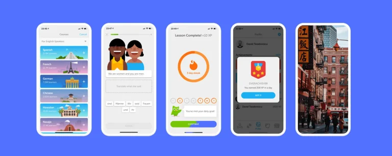
- Applying it in UI Design: The most significant use of the color red is done while making call-to-action buttons, notifications, and warnings. The red color is attention-gathering and sometimes triggers an immediate response without much calculation in the user’s mind.
Blue
Psychological Effect: Blue is a color said to be trusted also to be calming and professional. It relaxes and is mainly thought to be dependable and trustworthy.
Applications of UI Design: Blue is commonly applied in designing for business or professional websites, banking applications, and social media. This color elicits a sense of security and trust.
Green
Psychological Effect: It symbolizes nature, such as growth and being healthy. The color green is said to have a calming and refreshing effect and is, of course, predominantly associated with the concepts of equilibrium and harmony.
UI Design: Green is the most invasively used in health and wellness apps, eco-friendly product designs, and even in financial dashboards. It screams growth and stability, so it is applied perfectly in this setting.
Yellow
Psychological Effect: Yellow is a color of happiness, energy, and optimism—all of which are bound to catch the eye and force a smile on users’ faces.
UI Design: It tends to use yellow for highlighting critical information or promotions and happy elements. However, it should be used sparingly, as bombing will occur since it’s too much information if overused.
Purple
Psychological Effect: Purple implies luxury in generalized perspectives of creativeness and integration. It represents sophistication and mystery.
Applications of UI Design: Purple dominated in premium applications, beauty, and fashion. And creative industries. This brings the sense of elegance to any brand, and subconsciously sets it apart from other competitors.
Black And White
Psychological Impact: Black denotes power, elegance, and formality; however, white denotes purity, simplicity, and cleanliness.
Application in UI Design: Black and white are used to show contrast and readability. These colors represent the neutral background from which other colors may shine through. Most of the time, black represents the color for text, and white becomes the color in the background for simplicity and clarity.
Strategic Use Of Color In UI Design
The color psychology in UI design needs to be used strategically if you want to make the design effective and engaging:
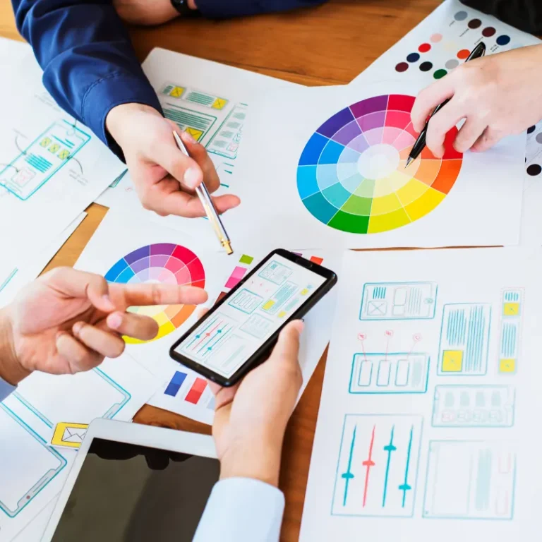
- Set up a color palette: A definite color palette will allow ease in the consistency and harmony expected in an interface. In most cases, it consists of primary, secondary, and accent colors that complement each other and should align with the brand identity.
- Make Color Accessible: Use colors in a way that is accessible to all, even those who may have some form of color vision deficiency. There should also be good contrast between the color of the text and the background; consider using a color contrast checker for this.
- Direct user behavior: Use color strategically to lead user behavior by highlighting points that are important, for example, using a single color for call-to-action buttons to attain consistency: it would be easy for any user to know where to click.
- Elicit the Intended Emotion: Select the colors that can elicit the intended emotion to be felt by the end-user. For example, if cool colors are used in a meditation application, it ensures the best experience for the user by creating a peaceful atmosphere.
- Testing and Iteration: Usability testing will help you to understand the perceptions and behaviors of the user related to using the chosen hues. Gather feedback and be prepared to make changes according to the wishes of the users and their behaviors.
Conclusion
Color psychology involves user perception and behavior when interacting with the interface. This will only come after mastering the effect that different colors have on people and how to employ them appropriately to create interfaces that really look great and help improve usability so users may get guided in the desired direction.
Of course, testing and iterating, like in any other design element, are very applicable to be sure that the color chosen responds effectively to the audience’s needs and preferences. The application of such theory in color psychology will allow a designer to actively connect with a user and create stimulating and effective user experiences on an emotional level.