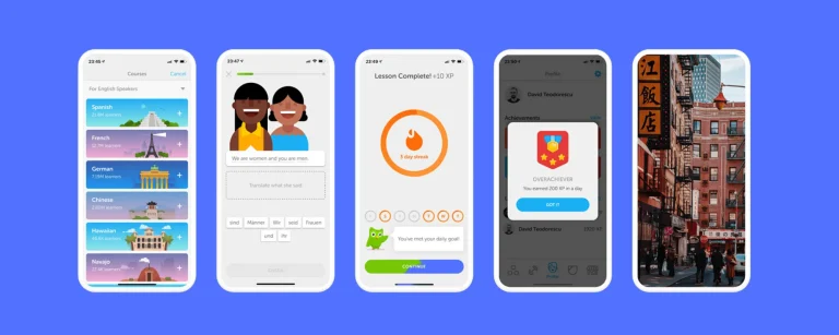
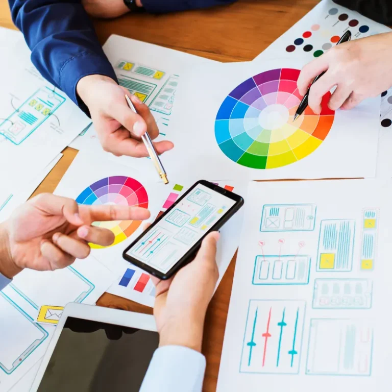
Minimalism has been the new rave in digital design today and seems to be changing our traditional view of what a user interface really is. It is a design philosophy emphasizing simplicity and elements that improve user experience and eliminate the peripheral. Thus, it means that minimalism in UI design is not an end, but it’s aimed at functionality, lucidity, and simplicity of use.
It provides refreshment across the digital landscape, crowded with information and features, creating a clean and intuitive experience for modern and timeless users.
Why It Matters?
Minimalism in UI design isn’t about being “less busy.” It comes out of a deeper understanding of user behavior and tastes. Nowadays, in such a fast-paced digital environment, users demand quicker and more efficient interfaces that enable them to achieve their goal on the very first instance. It’s where minimalism steps in to sweep away all the excesses and focus on what’s important.
- Improved Usability: Due to its simplicity, minimalist UI design contributes positively to the usability factor. This is the most significant reason behind its popularity. By decreasing the quantity of elements to be displayed on screen, designers can offer a cleaner and more intuitive experience to users. They will simply move through the interface and find the desired information or tools without getting lost in a sea of distractions.
- Faster Load Times: The next extreme benefit of minimalist design lies in performance. With fewer graphics, animations, and interactive elements to load, minimalist websites and applications tend to have improved performance. That adds greatly to a world that expects the delivery of content in almost an instant. Slow load times frustrate users and increase bounce rates—when the user abandons a site or app if it’s taking too long to load.
- Content Front and Center: In a minimalist design, all focus is given to the content. By cleaning out extraneous elements, designers can more easily draw the most real estate attention toward key information or actions users should accomplish. This becomes particularly very important in content-intensive sites like blogs, portfolios, and news outlets, whose main purpose is clearly and adequately communicating information.
- Timeless aesthetics: Design trends are a momentary thing; minimalism happens to exude timelessness, which can be trusted for long-term projects. As opposed to more complex or trend-driven designs that date very fast, minimalist interfaces don’t age that much. Their simplicity and focus on the essential elements keep them handy for a myriad of different contexts and content types.

Key Things To Consider In Minimalist UI Design
- White Space: White space, otherwise referred to as negative space in a composition, is an important element when it comes to minimalist design. This allows for the construction of balanced and clean layout so users easily direct their attention to the core content and functionality.
- Limited Color Palette: A minimalist design often restricts the quantity of different colors used in a design to largely neutral tones or a monochromatic color scheme. This will ensure the purity and homogeneity of design and that the use of color, however small, is focused.
- Simple Typography: Most of the typography in a minimalist design is plain in nature, and sans-serif font faces are mostly used. All the focus is given to the readability factor, making the type clear and readable without any ornamental or overly complex faces.
- Functional icons and buttons: They are created as a minimalist approach, so there will be simplicity in form without any extraneous embellishment to make them easily recognizable and usable.
- Clear visual hierarchy: One of the centermost ideas in minimalist UI design is a clean visual hierarchy. Good control over size, contrast, and position will assist designers in moving users through the interface in a rational and effective way.
Challenges Of Minimalism
On the contrary, while minimalist design has a lot to offer, it also comes with some challenges:
- Oversimplification: There’s always a thin line between simplicity and oversimplification. Too much stripping might cost the system some essential functionalities or make it less intuitive at the interface level.
- Content-Driven Design: The content-driven approach to minimalism can be heavily reliant on the quality of the content. Poor content can render the minimalist design thin or even unfinished.
- Aesthetic Vs. Functional: Embracing a minimalist aesthetic inherently means finding a balance with usability. Each element of design should be purposeful to improve the user experience—not scrape it.
Successful Examples Of Minimalist UI Design
- Apple’s Website: Apple is a renowned brand starting from its products down to its website. Ample white space with clear typography and limited use of color places one’s attention straight to what is more important—the product.
- Google Search: The Google homepage itself is among the greatest examples of minimalist design. Its simplicity allows users to pay focus exclusively on the search function, which is the core purpose of the interface.
- Medium: It is a great example of how minimalism can be applied to the content of the platform. A clean layout and simple typography ensure that nothing distracts from the reading experience.
Conclusion
Minimalism in UI design is more than just a fact—it’s a reflection of the changing needs and expectations of users. As digital interfaces are getting increasingly more complex, the demand for clarity and simplicity will grow.
By applying minimalist principles, designers can come up with interfaces that are not only beautiful to the eye but also functional and useful. The challenge is treading the thin line between simplicity and usability, ensuring that the design serves as a help, rather than a limit, to the user experience.


